In the world of marketing and branding, the power of color cannot be underestimated. Colors profoundly impact how consumers perceive and connect with a brand. Whether you’re a startup looking to establish your identity or a well-established company seeking to refresh your image, understanding the psychology of color in branding is crucial. This article will explore the fascinating relationship between color and brand identity, examining how different colors evoke emotions and shape consumer behavior.
The Psychology of Color
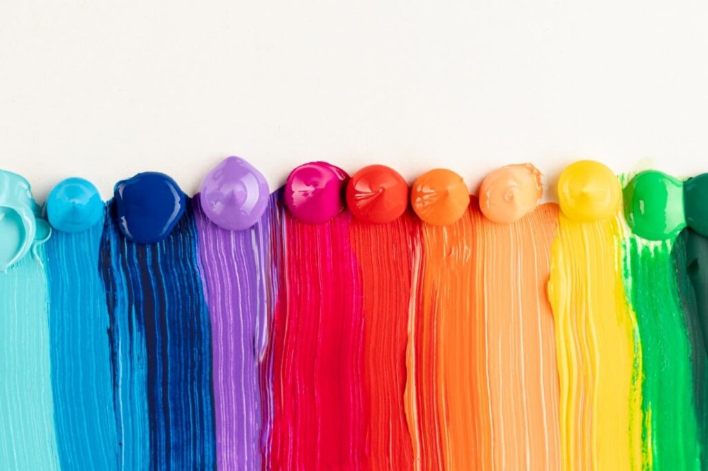
Before delving into the specific effects of different colors on brand identity, it’s essential to understand the psychology behind color perception. Colors can evoke emotions, trigger memories, and influence decision-making. Here are some key psychological associations with standard colors:
- Red: Is associated with passion, energy, and excitement. It can stimulate appetite (think of fast-food logos) and create a sense of urgency.
- Blue: Conveys trust, reliability, and professionalism. Tech companies and financial institutions often use it to establish credibility.
- Green: This is linked to nature, health, and growth. Eco-friendly brands commonly use it, and businesses focus on sustainability.
- Yellow: This is associated with happiness, optimism, and creativity. It can grab attention and is often used for children’s products.
- Black: Represents sophistication, luxury, and exclusivity. High-end fashion brands frequently incorporate black into their logos and packaging.
- Purple: This is linked to royalty, creativity, and spirituality. It can convey a sense of luxury and uniqueness.
- Orange: Combines the energy of red and the friendliness of yellow. It’s often used to create a sense of enthusiasm and approachability.
These are just a few examples of how colors influence emotions and perceptions. When selecting colors for your brand, consider the immediate emotional response and how they align with your brand’s values and personality.
Establishing Brand Identity
Your brand identity is more than just a logo; it’s the sum of all the visual and verbal elements that define your brand. Color plays a central role in establishing and reinforcing your brand identity. Here’s how:
- Creating Recognition: Consistency in color usage helps consumers recognize and remember your brand. Consider iconic brands like Coca-Cola with its distinctive red or Apple with its sleek white and silver palette. These companies have established a strong visual identity through consistent color choices.
- Conveying Values: The colors you choose can communicate the values and personality of your brand. For example, if your brand focuses on eco-friendly and sustainable products, using green can convey your commitment to these values.
- Targeting Your Audience: Different demographics have varying color preferences. Understanding your target audience’s psychological associations with colors can help you connect with them more deeply. A brand targeting children might use bright and playful colors, while a law firm might opt for more subdued and professional hues.
The Impact of Color in Branding
Now that we’ve explored the psychology of color and its role in establishing brand identity let’s dive deeper into how specific colors influence consumer perception and behavior.
Red: The Color of Energy and Urgency
Red is a high-energy color that grabs attention and creates a sense of urgency. Brands that use red often want to convey excitement and action. It’s commonly seen in fast-food chains like McDonald’s and KFC logos, where it stimulates appetite and encourages quick decision-making.
Blue: Trust and Reliability
Blue is one of the most widely used colors in branding because it evokes trust and reliability. Tech giants like IBM and social media platforms like Facebook use blue to establish credibility and professionalism. It’s a color that suggests stability and competence.
Green: Nature and Sustainability
Green is closely associated with nature and sustainability. Brands that want to emphasize their commitment to the environment, health, or growth often incorporate green into their logos and branding. Examples include Starbucks, which promotes its eco-friendly practices, and Whole Foods, which focuses on organic and sustainable products.
Yellow: Optimism and Attention-Grabbing
Yellow is a vibrant and cheerful color that exudes optimism and creativity. It’s excellent for capturing attention and creating a sense of happiness—brands like McDonald’s and Best Buy use yellow to stand out and convey friendliness and approachability.
Black: Elegance and Luxury
Black is the color of sophistication, elegance, and luxury. Many high-end fashion brands like Chanel and Prada incorporate black into their branding to convey exclusivity and timelessness. Black can also create a sense of mystery and allure.
Purple: Creativity and Uniqueness
Purple is associated with creativity, uniqueness, and spirituality. It’s a color that suggests a sense of luxury and individuality. Brands like Yahoo and Hallmark use purple to set themselves apart and evoke a feeling of creativity and innovation.
Orange: Enthusiasm and Playfulness
Orange combines the energy of red and the friendliness of yellow. It’s a color that radiates enthusiasm and playfulness. Brands like Nickelodeon and Fanta use orange to connect with a youthful and energetic audience.
Cultural Considerations
It’s important to note that the psychological associations with colors can vary across cultures. For instance, while red may symbolize luck and happiness in Chinese culture, it can represent danger in Western cultures. When expanding your brand globally, consider how cultural differences may impact color perceptions and adjust your branding accordingly.
The Role of Color in Logo Design
Your logo is central to your brand identity, and color is critical in logo design. When designing a logo, keep these principles in mind:
- Simplicity is Key: A cluttered or overly complex logo with too many colors can confuse consumers and dilute your brand message. Aim for simplicity and clarity in your logo design.
- Versatility Matters: Consider how your logo will appear in various contexts, from digital screens to print materials. A well-designed logo should be versatile and look great in color and grayscale.
- Test for Accessibility: Ensure that your chosen colors meet accessibility standards, making your brand inclusive to individuals with visual impairments. This involves selecting color combinations that provide sufficient contrast.
- Evolve with Care: If you update your logo or branding colors, do so cautiously. Sudden and drastic changes can confuse loyal customers. Gradual transitions and clear communication are critical when evolving your brand’s visual identity.
Conclusion
Color is a powerful tool in shaping brand identity and influencing consumer perceptions. Understanding the psychology of color and carefully selecting the right hues for your brand can create a lasting and meaningful connection with your audience. Whether you want to convey trust, excitement, sustainability, or creativity, the colors you choose will play a vital role in defining your brand’s identity in the minds of consumers.
As you embark on your branding journey, remember that it’s not just about the colors you pick, but how consistently and effectively you use them. A strong and cohesive visual identity will help your brand stand out in a crowded marketplace and leave a lasting impression on consumers.
In branding, color isn’t just a visual choice; it’s a strategic decision that can make or break your brand’s success.