Casinos are more than just venues for games of chance—they are finely tuned environments engineered to evoke emotion, capture attention, and encourage participation. From the moment a player steps inside or visits a casino’s digital lobby, color plays a subtle yet powerful role in shaping their experience.
In the world of gambling, where risk and reward intertwine with human psychology, color becomes a tool of persuasion. It stimulates the senses, creates atmosphere, and can even influence decisions. Whether physical or digital, the casino’s color strategy is often the first impression—and sometimes the last nudge players need to stay longer or place another bet.
The Emotional Palette of Casinos
Colors speak directly to the subconscious. They trigger emotional responses and shape behavior, often without us realizing it. Casinos leverage this in a deliberate way, using color schemes to align with brand values, target demographics, and emotional goals.
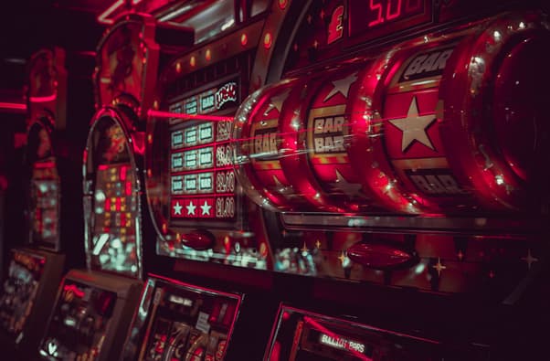
Red, for example, is nearly ubiquitous in gambling environments. It’s not just because red is bold and attention-grabbing; it’s also been linked to excitement, urgency, and stimulation. In many cultures, red symbolizes luck and wealth, making it a perfect emotional hook. Gold is another frequent player, associated with luxury, status, and winning. It’s not uncommon to see entire casino themes built around these two colors, creating a psychological link between color and potential reward.
Green, often used in card tables and backgrounds, brings a calming balance. It subconsciously evokes trust and fairness while also linking to money—an obvious association in financial and gambling contexts. Meanwhile, black and deep purples are typically used to convey exclusivity and VIP-level prestige, offering an elite experience for high-stakes players.
Creating Environments That Feel Fortunate
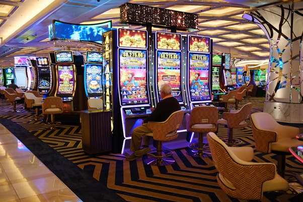
Color isn’t applied randomly. It is used with surgical precision across every element of a casino’s brand—from carpets and walls to user interface buttons and promotional banners. The goal is simple: create a space where players feel lucky.
A well-designed color system can reduce decision fatigue and improve navigation, especially in online casinos where clarity and excitement must coexist. Accent colors are chosen to draw the eye toward important elements, like sign-up offers, loyalty rewards, or limited-time promotions. It’s no coincidence that these CTAs often appear in gold, red, or neon contrasts.
In digital environments, this becomes even more critical. With so many players accessing platforms from their phones, a color strategy that guides attention and promotes engagement is vital. That’s where color harmonics—using complementary and contrasting tones—come into play, ensuring not just appeal but functionality.
Casino designers also consider lighting as a color-enhancing element. The strategic use of LEDs, warm yellow lighting in lobbies, or cool tones in gaming areas can drastically shift player mood. Red lighting in slot machine zones may subtly energize players, while calmer blue tones near bars or rest areas encourage breaks and longer dwell times.
When brands incorporate offers like 30 free spins, they often showcase them in the brightest colors on the page—designed to be unmissable. One example of this can be found here: https://playfortune.net.br/bonus/30-rodadas-gratis/ — a vivid visual of how bonus promotions are framed within a specific color system to maximize user interaction.
Building Trust and Brand Identity Through Color
Color is not just emotional—it’s strategic. Successful casinos use color to build long-term brand recognition and trust. Just as tech brands lean into blue tones for a sense of reliability, casinos craft their identities through palettes that suggest fortune, excitement, and sophistication.
Color consistency across all touchpoints—physical signage, mobile interfaces, print materials, and even merchandise—reinforces the brand’s reliability and message. This is especially crucial when targeting an international audience where cultural interpretations of color may differ. For instance, while red may symbolize good luck in China, it could also evoke aggression or urgency in Western markets. Knowing the nuances can make or break a campaign.
Here’s how casinos make color work long-term:
- Consistency: Colors remain uniform across platforms—mobile, desktop, social, and advertising.
- Cultural sensitivity: Color preferences and meanings vary globally. Smart branding accounts for regional interpretations.
- User segmentation: VIP users may see darker, richer tones, while newcomers get brighter, more playful schemes.
- Thematic coherence: Seasonal or event-based updates shift color palettes while staying within the core identity.
Some platforms have even developed dynamic themes that adjust color schemes based on user behavior or time of day, creating a highly personalized experience. This responsiveness adds another layer of connection and immersion that can’t be ignored.
Final Thoughts: More Than Just Aesthetic
In the high-stakes world of gambling, where decisions happen in split seconds, color can be the difference between engagement and exit. It’s a silent actor on the casino’s stage, directing attention, evoking emotion, and reinforcing brand memory.
Color is not merely an aesthetic decision—it’s an emotional and psychological investment. In a space driven by feelings of hope, thrill, and reward, color guides players through a carefully orchestrated journey. It not only enhances the experience but defines it.
As digital competition increases, so too does the need for color strategies that are not only beautiful but also effective. For designers, marketers, and developers in the gambling space, understanding how color influences behavior isn’t optional—it’s essential.
Ultimately, lucky branding isn’t about superstition—it’s about strategy. And when it comes to visual storytelling, color is the house’s biggest advantage.